We came across an interesting pair of graphs, courtesy of NPR, that we wanted to share with you guys. One graph shows the falling rate of carpoolers and the other graph displays the types of transportation people use to get to work. The top result was cars, of course, followed by public transportation and walking.
The graphs were interesting for a number of reasons (less people work at home now than they did in the 1960s? Really?) But they really drive home(sorry) a point that many people are already well aware of. And that is just how much the average worker relies on their vehicle for their livelihoods.
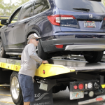
And this is a fact we’ve based our business on. Each time we accept an order we are well aware that we’re transporting more than just heaps of metal, glass and rubber, but someone’s livelihood. That’s why we take extra care to make sure your car gets exactly where you need it too, safe and sound.


Comments by Direct Connect Auto Transport